Algonquin College
50th Anniversary Logo
Branding | Digital + Print Design
Animation created for the unveiling of the AC50 logo
Designing the Face of Year 50
The 50th Anniversary Logo was created to be flexible and exist within the College's existing branding and environment. With that in mind, three variations are available depending on the placement. A full info label identifies the college to those that do not recognize the AC, a variation with the date acts as an on-campus celebration of the achievement, and the AC50 alone is iconic as a graphic symbol.
After designing the logo and creating the logo animation, Sarah has continued to work with Algonquin College as an in-house designer in creating various AC50 pieces for use during the festivities. These include the expandable AC50 pop-up banners, flags as seen along Woodroffe Avenue and on campus, and various print and digital materials.

Roadside banners I designed line the roadway on Woodroffe Ave. pictured here in front of the floor-to-ceiling window decals on the bridge.
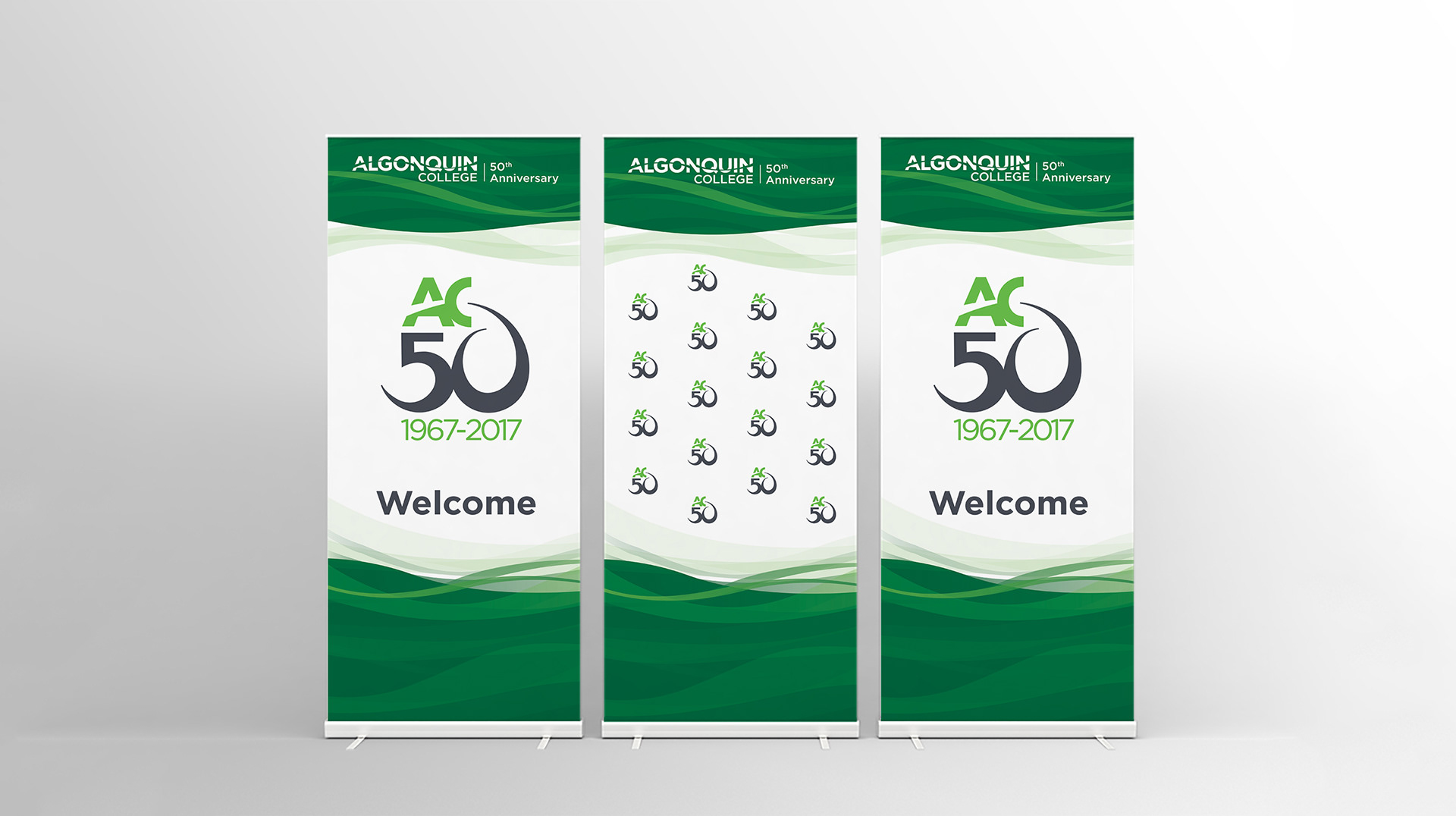
Background rollout banners for media and special events — 5 copies of inside patterned banner printed for photo background coverage
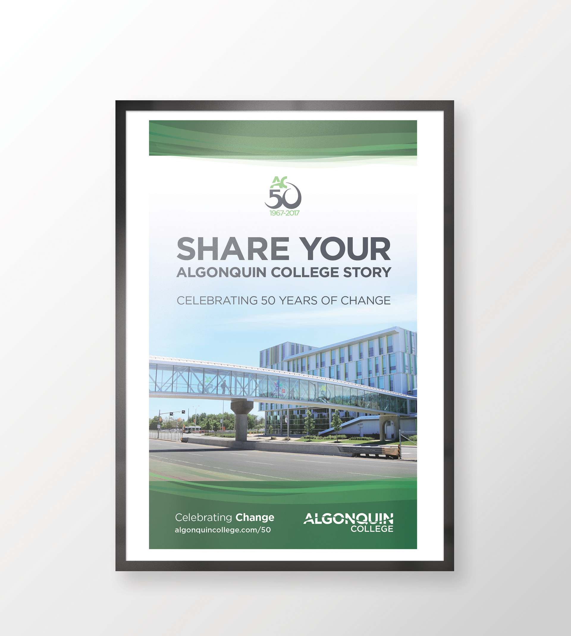
A general interest poster I designed that kicked off the celebrations on-campus, and leading to the online campaign to collect stories from those involved with Algonquin College over the past 50 years.
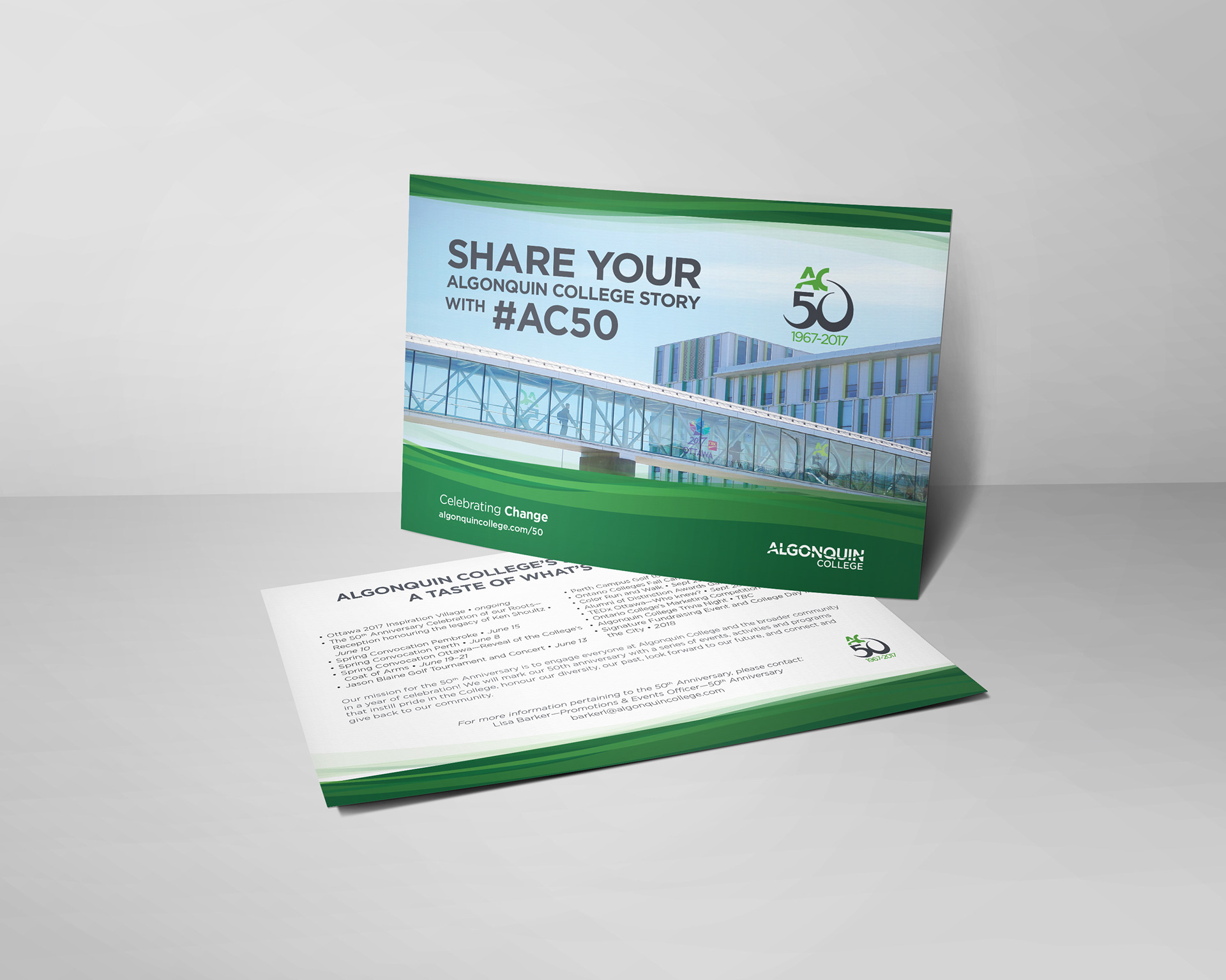
Promotional postcards I designed for the numerous events we would be holding and participating in.
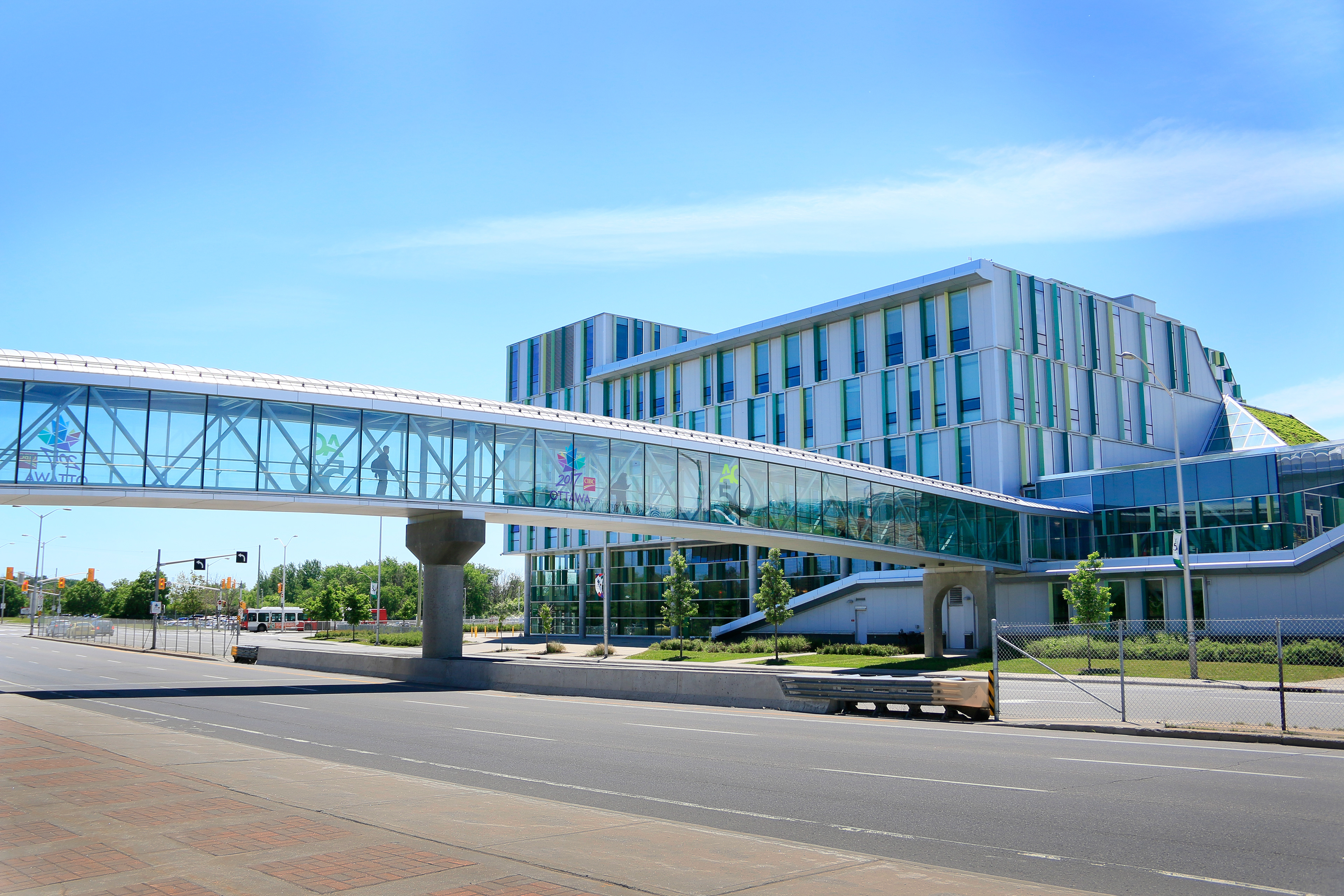
The vinyl window AC50 decals over Wodroffe Avenue with partnership from the City of Ottawa for their 2017 celebration
The Story Behind the Celebration
The College’s 50th Anniversary logo design represents the four themes of the celebration: pride, connection, give back, and diversity. The elements in the logo come together to create a cohesive symbol to front the celebrations in the coming year, while fitting with the college’s existing branding. The focus in the logo is on the hand-lettered 50, symbolizing the celebration and excitement with dynamic streamer-like form.
The zero in the 50 was shaped to symbolize arms outstretched, a direct reference to the strong and diverse community here at Algonquin College, and our reaching upward toward the future. This pictorial meaning also references the give back theme, where we are thanking each individual for their part in Algonquin College’s success over the past 50 years.
The two colours used, New Growth Green and Cool Grey 10, were chosen from the brand colours to work with the themes as well. The green represents the sustainability, growth, and positive change Algonquin College is working toward with various forms of innovation. This is especially found in the digital technologies that create connections in academics and also promote them to people, places, and ideas geographically far away. The grey, as a more mechanical and sleek colour, references the use of digital and technological innovation. It also acts as a celebratory colour as Algonquin College is valued and awarded for the accomplishment of 50 successful years.
Make sure to check out “Celebration Alley” on Woodroffe Avenue now through 2018!
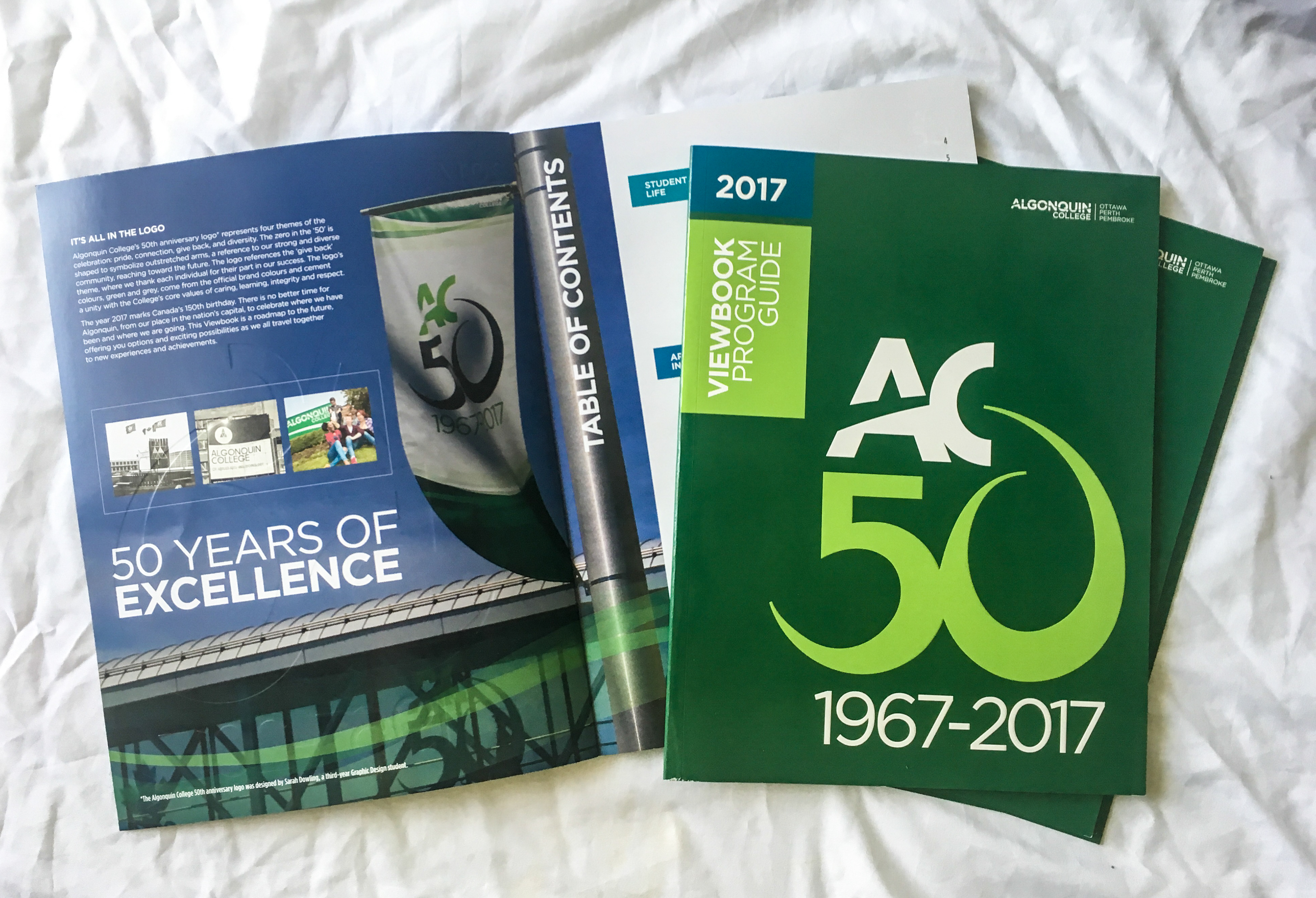
The logo appeared as the main visuals for the 2016–2017 Algonquin College Viewbook. (Cover layout & spread designed by Kim Boston)
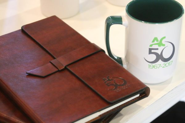
AC50 merchandise is available at the campus bookstore, Connections. I love the mugs!