Triangle Sewing Centre
A new look for a beloved community store


Triangle Sewing Centre is located in the “Golden Triangle” of Kitchener, Guelph, and Cambridge. Their location in downtown Guelph is convenient for all of their clients living in both the urban and rural surrounding areas. With their over 40 years of experience, they are trusted with sewing machine repairs, purchases, as well as appeal to new and experienced quilters with their many interesting classes. They also offer many different sewing supplies and fabrics for use.
Their audience includes those from the golden triangle who have been sewing for a long time, attracting them with their classes, supplies, and repairs, as well as new crafty people. The audience comes from both rural and somewhat urban settings within this area. Sewing can be intimidating and expensive, so it is important to trust your supplier.
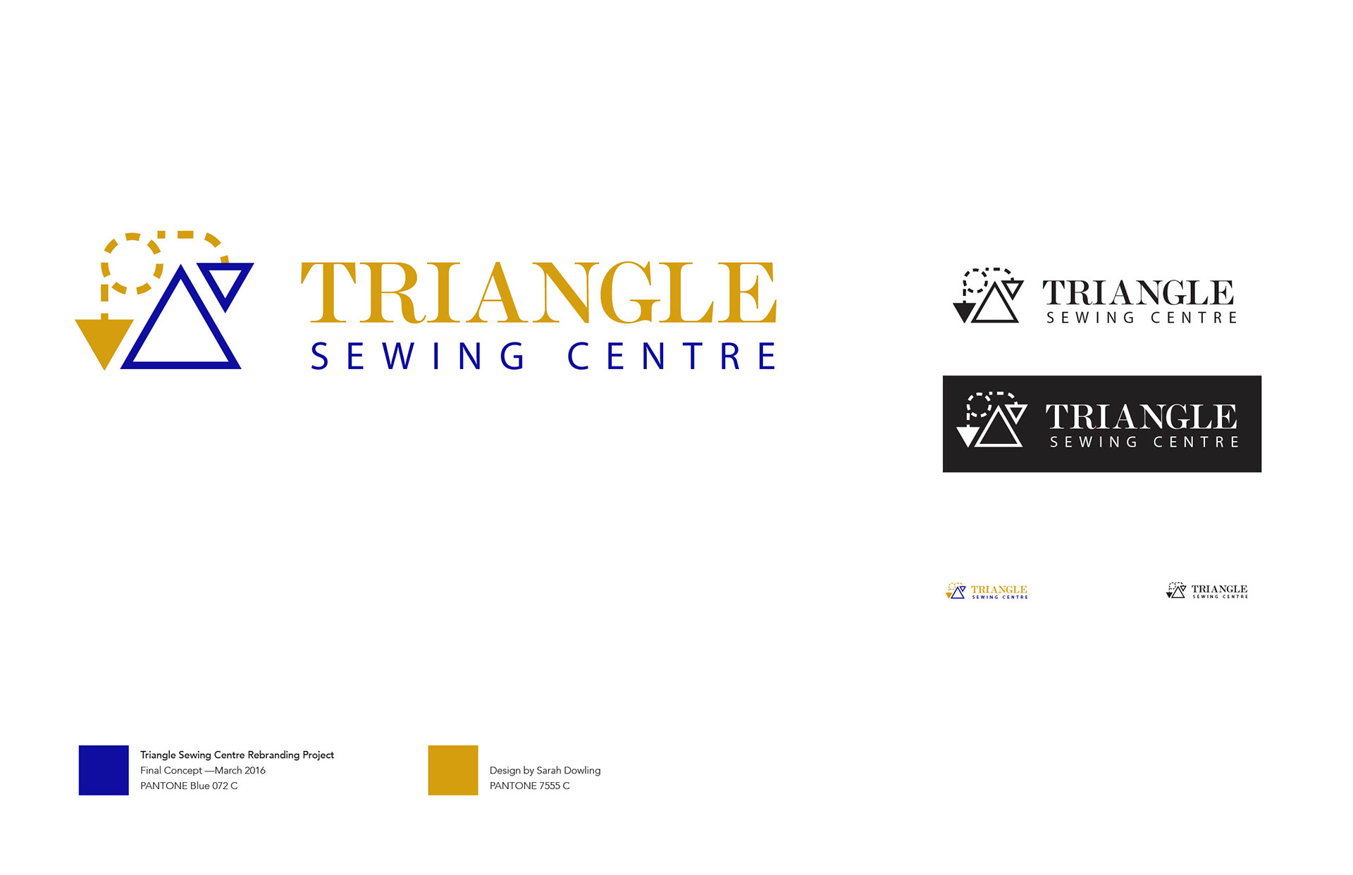
The colours chosen for the new logo are representative of colours they currently use, a blue/purple (PANTONE Blue 072 C) and a yellow/gold (PANTONE 7555 C). This combination reflects the feeling of royalty found in the name Golden Triangle which is where the business’ name came from, and Guelph is known as "The Royal City". It also adds great contrast internally, making the logo more visually interesting and eye-catching, since they are variations of primary colours.
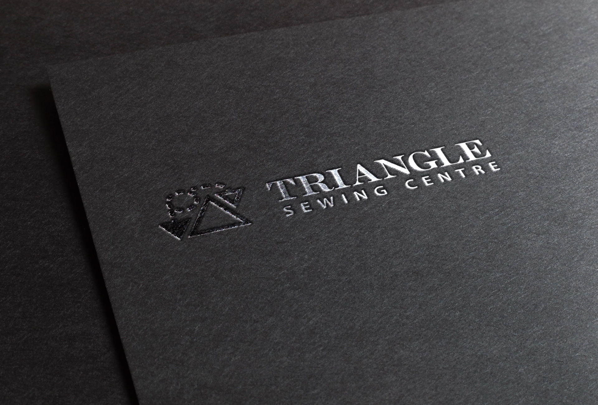
This concept is a bridge between corporate and crafty, with the triangle symbol acting as a reference to the quilting the business supports. Triangle Sewing Centre is able to repair sewing machines, and is able to help customers choose the perfect new machine as well. This process requires a lot of trust in the store, which is why the corporate look was important to include. The three triangles making up the symbol with one triangle appearing to move forward by the dashed motion. This line is also reminiscent of the running sewing stitch, but adds a layer of fun reflecting the business’ aim to attract new quilters and crafty people alike.
The fonts used include a serif with triangular characteristics, and a sans serif to create internal contrast and make the design more modern rather than using two instances of the serif font. This pairing puts emphasis on the triangular identifying features of the serif font, adding to the logo’s identity.
This logo works well if the business wanted to put the logo merchandise, since the symbol and wordmark stand strong on their own, as seen in the example of the mugs.