
Environmentally Conscious Packaging
Repackaging a Currently Concerning Product

Further Information
This product was chosen to redesign because the original packaging used very heavy moulded plastic in a non-efficient shape. Although the packaging protects the crisp cookie sticks and the dip well, the excess of plastic created by this single serve disposable container is far in excess of what is acceptable for this product. It is also a new product, so I thought it would be best to target this product before the company creates more products with this sever overuse of plastic.
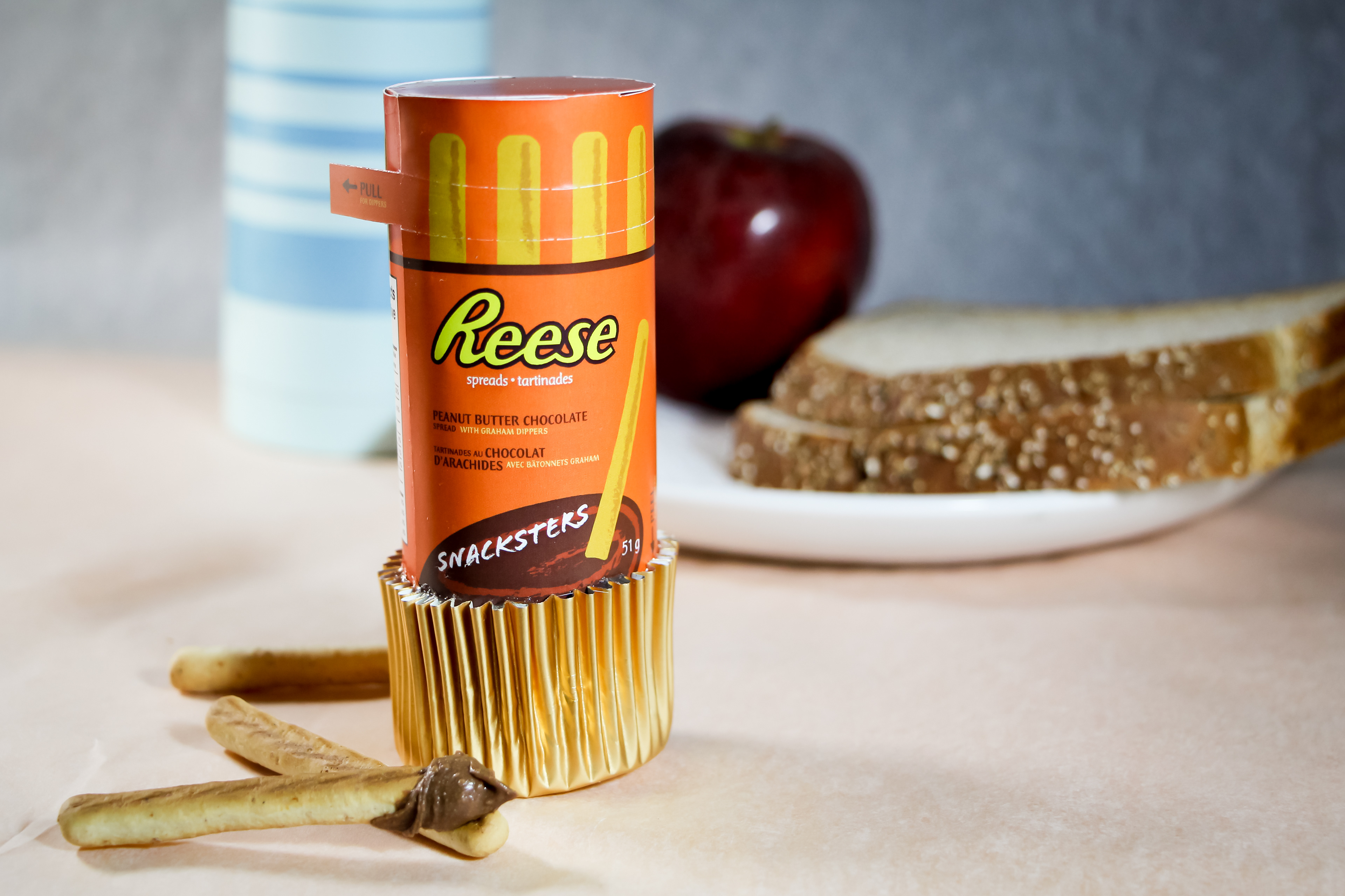
The new design is focused around both the consumer’s idea of Reese as a brand, as well as how the snack is interacted with in terms of the cookie sticks (“graham dippers”) being dipped into the peanut butter chocolate spread. Reese is very well known for their Reese’s Peanut Butter Cups, which come most commonly in a pack of three and the cup has a brown cupcake wrapper-like wrapping that they sit in. The user must peel off the wrapper to eat the candy, and they have three of the cups to enjoy in one usual serving. For the design, I used this familiar action of peeling off a wrapper as the attachment container for the cup of dip that comes in my design. The cup sits within the wrapper like a peanut butter cup does, and the user must peel away the wrapper to access the dip. This really would appeal to the target audience who like interaction with their hands, and may pick the snack because of the dipping action involved, this package feature really exaggerates that experience. The tube containing the cookie sticks can be accessed by a perforated pull-tab, further making this snack easy to access.
There is a cookie stick design used on the top of the tube so the user can see where each part of the product is. On the front, the dip portion of the design carries down into where the spread actually is, and a further additional label is provided if the user still does not understand where the spread is.
The additional element I created was a wrapper label for a pack of three of these snacks. This was chosen to reference the original Reese’s Peanut Butter Cups packaging of three, and also creates appeal by being advertised as a great addition to your lunch box. The label repeats the information that becomes covered by the label so the consumer can see everything, and also allows the brand’s logo to appear a bit larger than is able to be had on the small individual tubes. The motif of cookie sticks around the top was continued over and featured a bit more dominantly on the wrapper compared to the tube where it was also used so the user is able to see what part of the product is where.
I wanted to use primarily recyclable paper in the design to make it eco-friendly, and with the cookies being prone to going stale if left out, and the spread able to leak, I incorporated a bit of thin plastic in two places. The first is a sealed clear baggie that contains the crackers. This sits within the package’s tube — a shape that was chosen because of the cookie stick’s shape. The second is the thin yogurt-cup thickness of plastic used in the cup the spread is sealed within, which is Reese’s brand orange. A shiny foiled paper wrapper was also used for the wrapper holding the spread cup to signal that this is a special treat — running in at around $1.50 this treat is priced higher than a normal package of Reese’s Peanut Butter Cups. The foil also appeals to the target audience, who may have more limited funds, but are indulging themselves in a little treat and so this makes the experience improved.
This design contrasts the competitors’ designs and creates a precedence to make packaging that is more environmentally aware, especially with single serve treats. The interaction of opening the package is appealing, and the design and colours used are fun and play off of the original packaging and fit with the Reese brand.
Original Package Design
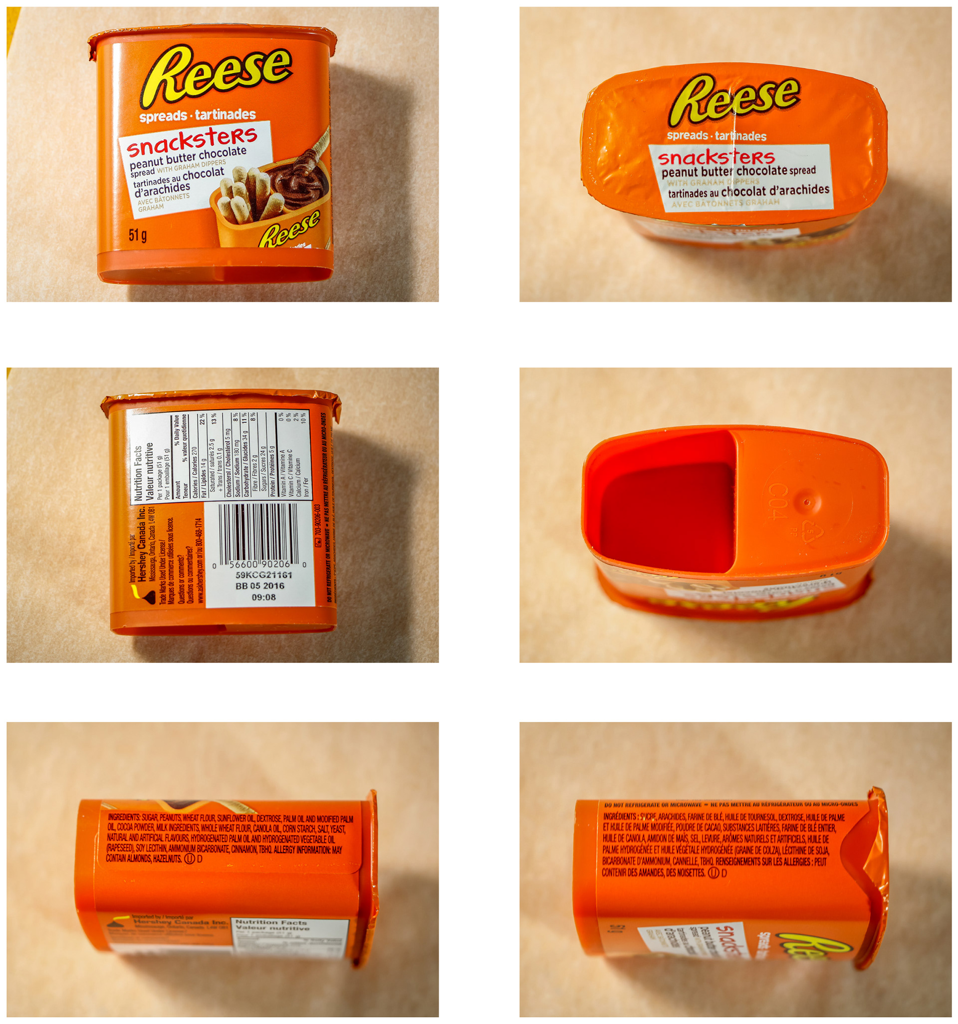
The above original packaging is bad for the environment with so much packaging to be thrown away, so a better design was really needed.