
Infographic-Inspired Annual Report Layout for CHEO
Includes French & English versions in one book
Full PDF View: https://goo.gl/uivQUu
This annual report design was centered around two main concerns: the first being ease of use in business meeting situations; the second being cost efficiency. Since the target audience for this book consists of mainly businesspeople concerned about CHEO’s operation and financial status,and this printed book would be used in meetings, having areas to take notes in and enough space to highlight key areas was taken heavily into consideration. Secondly, since CHEO would not have a large budget for printing of these booklets that could be just as easily (if not more so) distributed online, printing options that would cost less were chosen (8.5x11in no bleed and lay-flat coil binding). Lastly,the theme applied in essence to this book was infographic and iconic, in that the graphics are straight and to the point in visually aiding in comprehension of the big ideas of the book, and it also compliments the branding CHEO had started taking direction with in the previous years’ annual reports.
Colours chosen were taken from CHEO branding to make use of consistency to their branding standards, and narrowed down to a focus on their main yellow, and four other contrasting accent colours to provide visual interest in the book since there are no colour photographs. The yellow is indicative of highlighter and sticky notes used to communicate in office situations, as well as the attention-grabbing yellow heavily used in traffic signs to communicate quickly and efficiently in symbolic form. This colour combination complimented the iconic symbols used to separate section sand was brought together with the double arrow motif used throughout the book. This arrow is representative of a fast forward symbol, indicating the advancements the foundation is assisting with, and the focus on the future and making the future better for infants and children.
The font chosen is a sans serif, chosen to reference fonts used traditionally in infographics, and because this annual report would also be placed online, where sans serif fonts are easier to read. Acumin Pro with both bold and regular weights at different sizes were used to create a strong hierarchy leading to better ease of use for the reader.
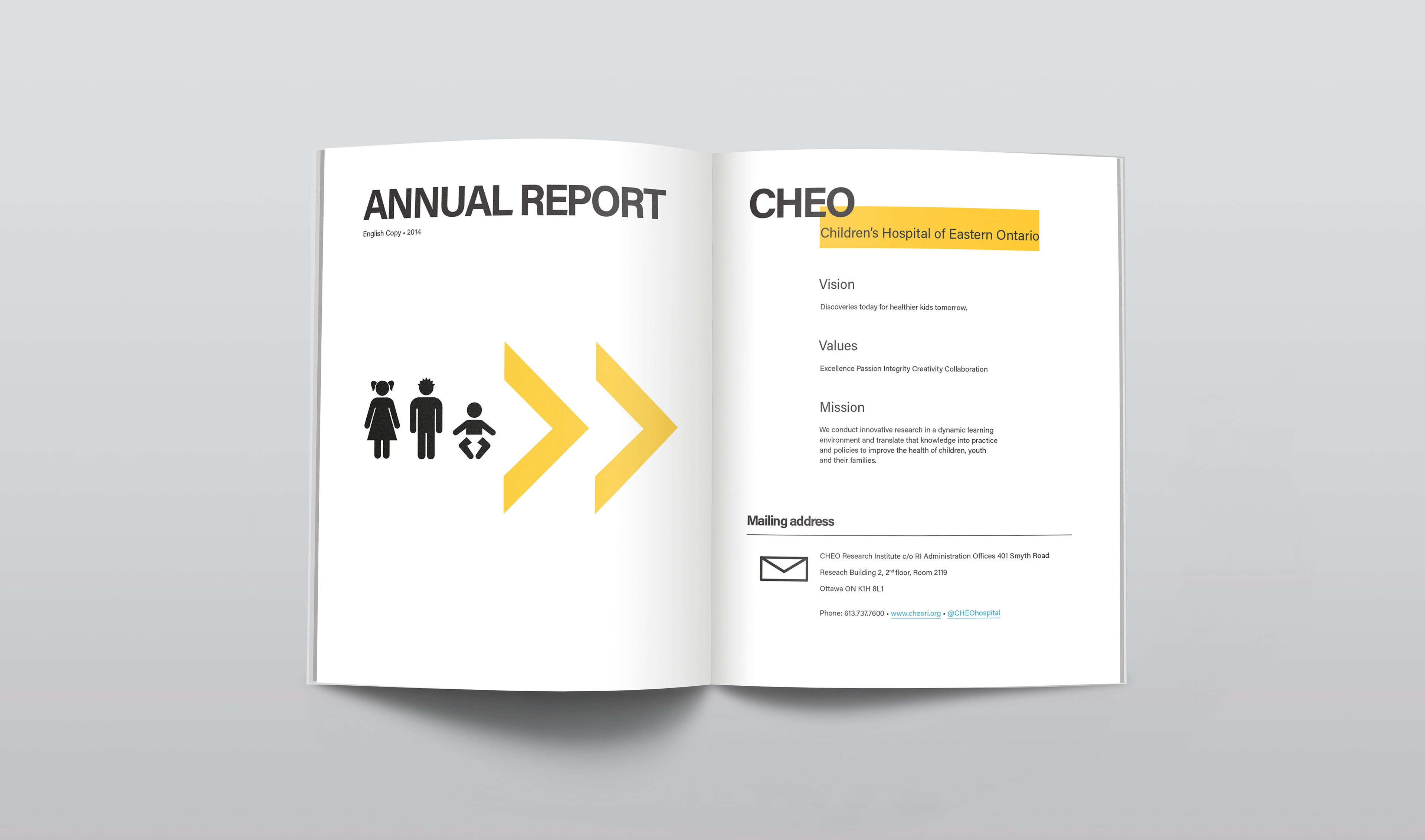
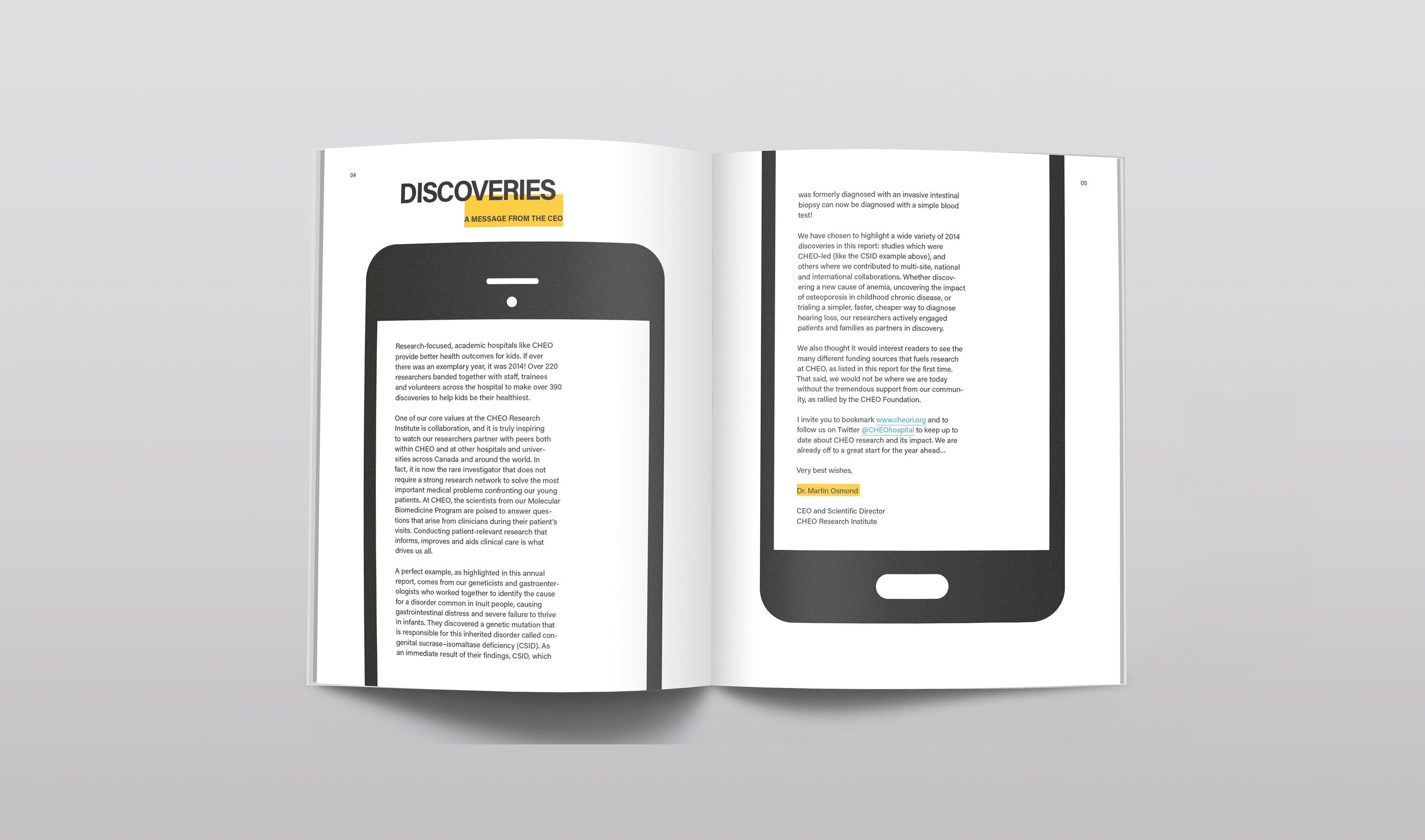
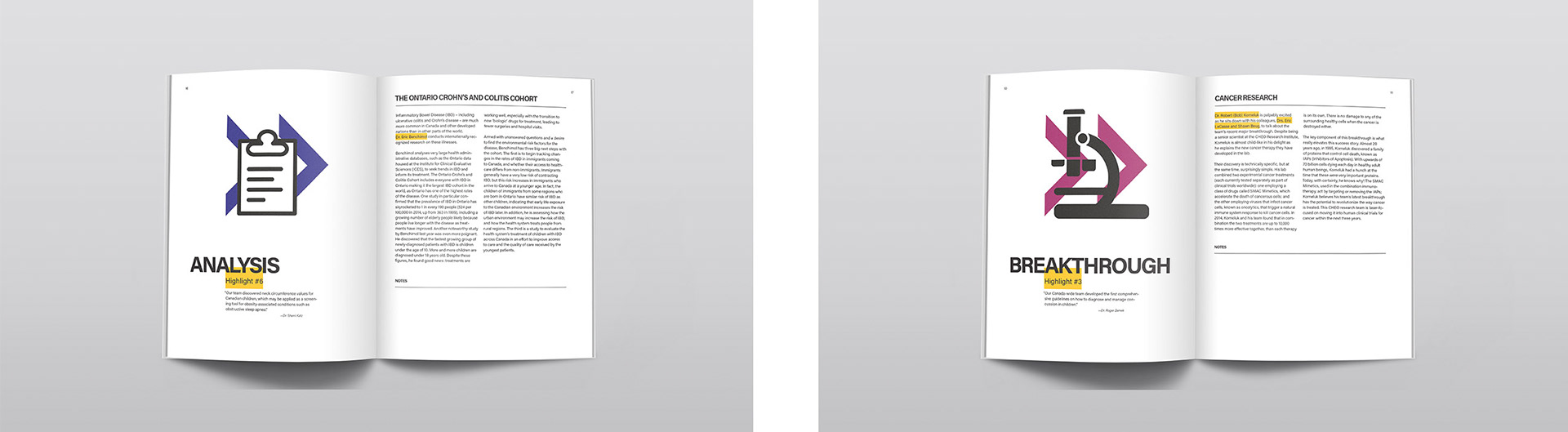
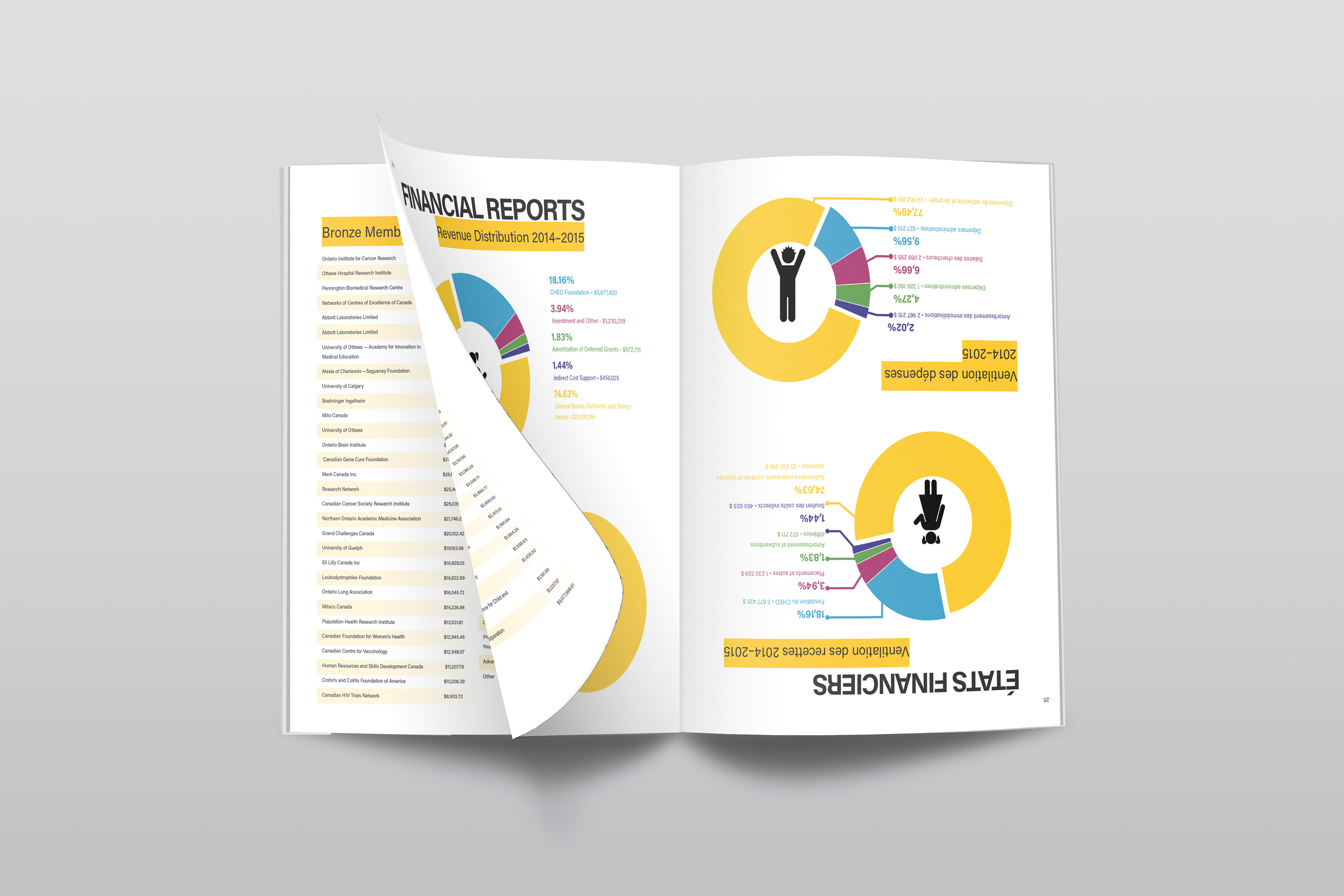
The first two pages following the cover (pg. 2 and 3) focus on getting the reader the most important information quickly. As such, the table of contents, language of the report, year, vision/values/mission statements, and mailing address were all placed where the reader could find the mall at a glance. Following this, each main update story is separated by a highlight page so the reader flipping through can quickly see the theme of each spread. The first instance of each doctor’s name in each article is highlighted to emphasize their importance since those providing the funding reading the report would want to know where their money is going, and the doctors’ importance in the foundation is also visually emphasized. The funding agencies’ pages were separated by the amounts each agency provided. Ease of reading is assisted with a gradient yellow separating vertical entries, with the horizontal s broken up by the gradients halting at the end of the cell. Finally, the financial reports were shown graphically with large pie charts utilizing the report’s colour theme, along with larger clear numbers showing the precise amounts the charts’ sections indicate.
Finally, the report booklet was designed so it is composed of a French section, and flipping the booklet over, an English section. Both sections have the same page numbers for the same sections so if a bilingual meeting is taking place, all parties can turn to the same page in their section of the book, and not worry about wasting time looking for the French sections intertwined in the English verse, and vice versa. It is a more efficient method of layout, and the mirrored layout keeps equality between languages.